Custom styling
Match the widget to your brand with CSS variables or your own components.
The widget ships with a neutral default theme, but every surface is built to be restyled. There are two ways to do it, from quickest to most flexible:
- CSS variables — override a handful of
--confetti-*custom properties to recolour the default widget. No code changes. - Build your own widget — compose the primitive
components yourself and style them with
classNames. Full control over layout and look.
CSS variables
Every colour, radius, and spacing token in the widget reads from a
--confetti-* CSS custom property. Override them anywhere the widget is
rendered — :root is the simplest — and the change cascades through the whole
survey.
The same survey below, restyled with nothing but a few CSS variables:
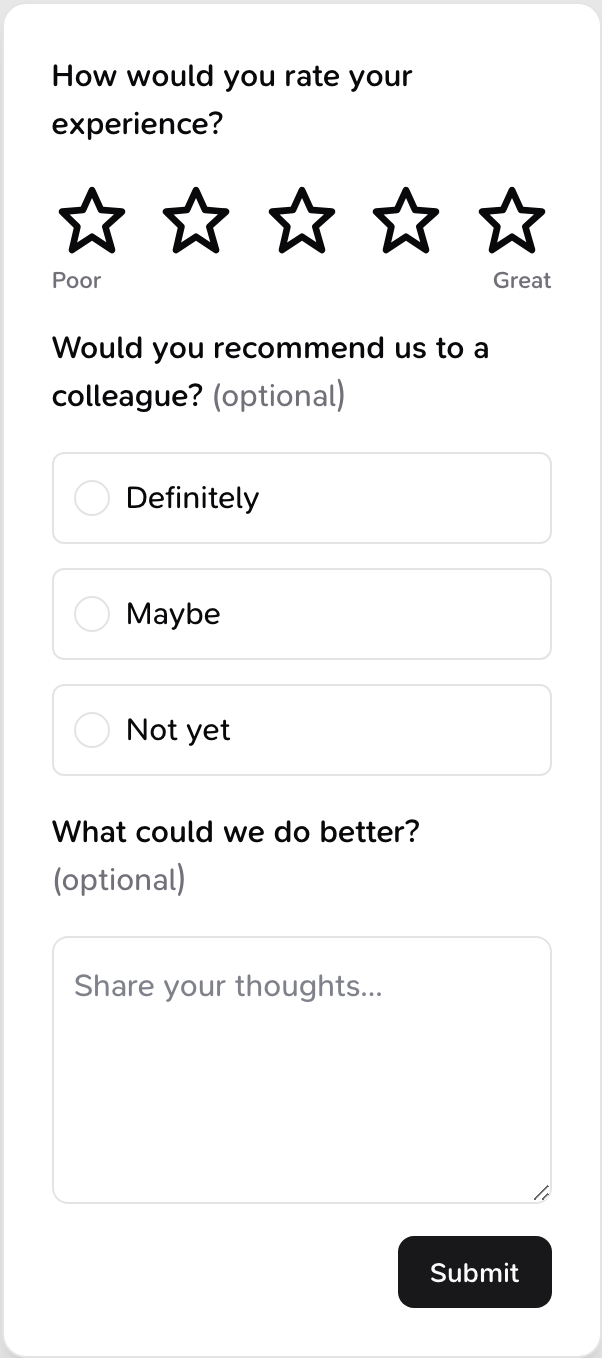
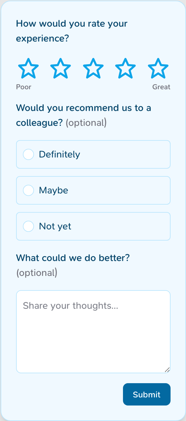
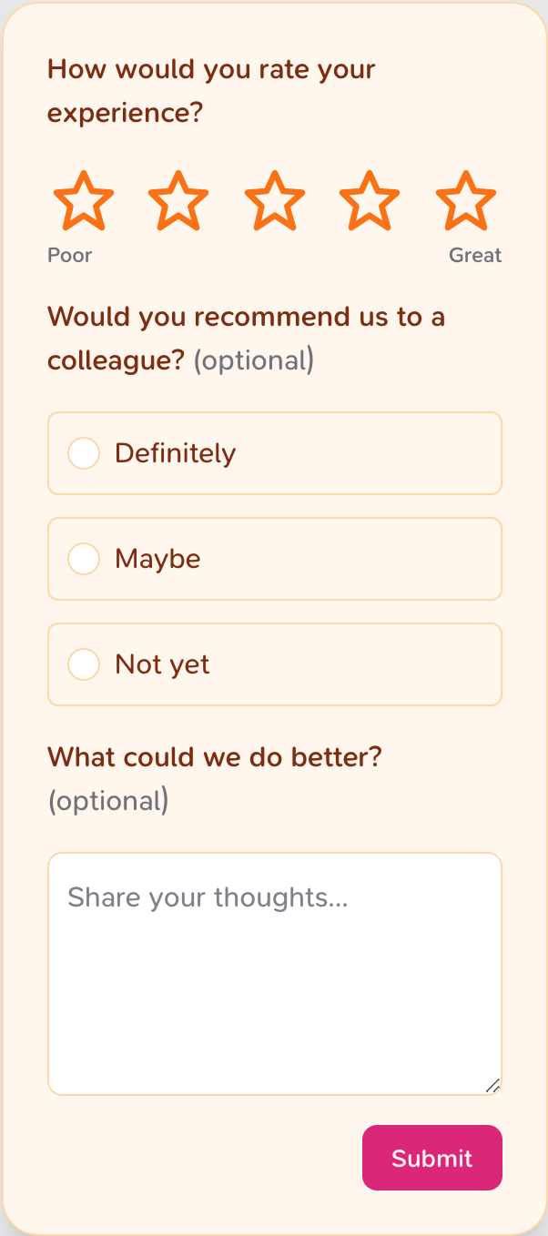
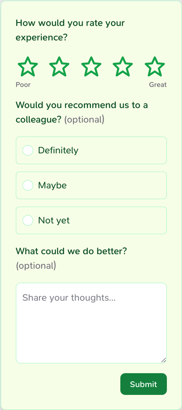
Try it yourself — pick a theme or tweak a colour and watch the live widget update:
Theme
Show CSS
:root {
  --confetti-submit-button-color: #18181b;
  --confetti-submit-button-text-color: #fafafa;
  --confetti-rating-active-bg-color: #09090b;
  --confetti-rating-active-text-color: #ffffff;
  --confetti-text-primary-color: #09090b;
  --confetti-background-color: #ffffff;
  --confetti-border-color: #e4e4e7;
  --confetti-border-radius: 12px;
}
How to override
Add the variables you want to change to your own stylesheet, after importing
confetti.css:
@import '@opengovsg/confetti/confetti.css';

:root {
  --confetti-submit-button-color: #0369a1;
  --confetti-rating-active-bg-color: #0ea5e9;
  --confetti-border-radius: 16px;
  --confetti-background-color: #f0f9ff;
}
Variables cascade like any other CSS custom property. Set them on :root to
theme every widget on the page, or on a wrapping element to theme a single
embed.
Available variables
Defaults
The values below are the widget's defaults. Override only the ones you need — anything you leave out keeps its default.
Surface
| Variable | Default | Controls |
|---|---|---|
--confetti-background-color | #ffffff | Widget background |
--confetti-border-color | #e4e4e7 | Borders and dividers |
--confetti-border-radius | 12px | Corner rounding of the container |
--confetti-box-padding | 24px | Inner padding of the container |
--confetti-max-width | 300px | Maximum width of the widget |
--confetti-box-shadow | (shadow) | Container drop shadow |
--confetti-z-index | 2147483647 | Stacking order of the widget |
Text
| Variable | Default | Controls |
|---|---|---|
--confetti-text-primary-color | #09090b | Question titles and body text |
--confetti-text-subtle-color | #71717a | Descriptions and helper text |
--confetti-font-family | (inherited) | Font family for all text |
--confetti-font-scale | 16px | Base font size |
Submit button
| Variable | Default | Controls |
|---|---|---|
--confetti-submit-button-color | #18181b | Button background |
--confetti-submit-button-text-color | #fafafa | Button label colour |
--confetti-disabled-button-opacity | 0.6 | Opacity when disabled |
Rating
| Variable | Default | Controls |
|---|---|---|
--confetti-rating-bg-color | white | Unselected rating background |
--confetti-rating-text-color | #09090b | Unselected rating colour |
--confetti-rating-active-bg-color | #09090b | Selected rating background |
--confetti-rating-active-text-color | white | Selected rating colour |
Inputs
| Variable | Default | Controls |
|---|---|---|
--confetti-input-background | white | Text input background |
--confetti-input-text-color | #020617 | Text input colour |
--confetti-hover-background-color | #f5f5f5 | Hover state background |
--confetti-focus-shadow | (ring) | Focus ring around inputs |
--confetti-outline-color | rgba(9,9,11,0.8) | Keyboard focus outline |
Trigger button
The floating button that opens the TriggerPopoverConfetti widget.
| Variable | Default | Controls |
|---|---|---|
--confetti-trigger-bg-color | #18181b | Trigger background |
--confetti-trigger-text-color | #fafafa | Trigger icon colour |
--confetti-trigger-size | 40px | Trigger diameter |
Build your own widget
When CSS variables aren't enough — you want a different layout, your own
components, or design-system styles — drop down to the primitives and assemble
the widget yourself. Import them from @opengovsg/confetti/components.
The interactive survey below recolours and reshapes every part of the survey
using only the classNames prop each primitive accepts. It's driven by a custom
question factory — the exact code follows.
1. Style primitives with classNames
Each question component (Rating, SingleChoice, MultiChoice, FreeText,
Statement) accepts a classNames object. The keys map to the individual
elements inside the question, so you can target exactly what you need — your
classes are merged on top of the widget's own:
<Rating
  id="rating"
  title="How would you rate your experience?"
  properties={{ type: 'rating', scale: 5, display: 'star' }}
  onChange={handleChange}
  classNames={{
    question: 'my-question',
    title: 'my-title',
    ratingStar: 'my-star',
  }}
/>
Render your primitives inside an element with the confetti class and import
confetti.css so the base layout and your CSS variables still apply. Because
your classNames are added alongside the widget's own classes, a slightly
more specific selector (e.g. scoping under .confetti) will win.
2. Write a custom question factory
A survey has many questions of different types. Rather than wiring each one by
hand, write a factory that maps a question to the right primitive — a styled
replacement for the built-in SurveyQuestionFactory. This is exactly what
powers the live demo above:
import type { SurveyQuestionFactoryProps } from '@opengovsg/confetti/components'
import { FreeText, Rating, SingleChoice } from '@opengovsg/confetti/components'

export function CustomQuestionFactory({
  question,
  onChange,
  error,
}: SurveyQuestionFactoryProps) {
  switch (question.properties.type) {
    case 'rating':
      return (
        <Rating
          {...question}
          properties={question.properties}
          onChange={onChange}
          error={error}
          classNames={{ question: 'my-question', ratingStar: 'my-star' }}
        />
      )
    case 'single-select':
      return (
        <SingleChoice
          {...question}
          properties={question.properties}
          onChange={onChange}
          error={error}
          classNames={{ question: 'my-question', radio: 'my-choice' }}
        />
      )
    case 'open-ended':
      return (
        <FreeText
          {...question}
          properties={question.properties}
          onChange={onChange}
          error={error}
          classNames={{ question: 'my-question', textarea: 'my-textarea' }}
        />
      )
    // Cover 'multi-select' and 'statement' the same way. A visible fallback
    // surfaces any unhandled type instead of silently dropping the question.
    default:
      return <div>Unsupported question type</div>
  }
}
3. Wire it up end to end
Finally, load a real survey, track its state, and submit responses by composing
your factory with the Confetti controller. The controller fetches the survey
and exposes it via a render prop; Flow manages the current question's answer
and validation, and hands your factory the props it needs:
import '@opengovsg/confetti/confetti.css'

import { Confetti, Flow, ThankYouMessage } from '@opengovsg/confetti/components'

import { CustomQuestionFactory } from './custom-question-factory'

export function CustomSurvey() {
  return (
    <Confetti
      surveyId="<your-survey-id>"
      publishableKey="<your-publishable-key>"
      respondent="<user-id>"
    >
      {({ current, questions, update, isSubmitted }) => {
        if (isSubmitted) return <ThankYouMessage />

        const question = questions[current]
        if (!question) return null

        return (
          <Flow
            key={question.id}
            question={question}
            isLastQuestion={current === questions.length - 1}
            onSubmit={(answer) => update({ question: current, answer })}
          >
            {/* `flowProps` is `{ question, onChange, error }` — exactly what
                CustomQuestionFactory expects. */}
            {(flowProps) => <CustomQuestionFactory {...flowProps} />}
          </Flow>
        )
      }}
    </Confetti>
  )
}
Want the same control but happy with the default question layout? Swap
CustomQuestionFactory for the built-in SurveyQuestionFactory and theme it
with CSS variables instead.